Saturday 28 April 2012

From Word to Image review

In my search to find any useful material for an aspiring Storyboard artist, I had assumed they would be- as with most other practices- a 'holy grail' book that every practitioner would swear by. Initially disappointed that Storyboarding didn't appear to have one, I nonetheless picked up some fantastic insightful publications: 'Framed Ink' (author: Marcos Mateu-mestre); 'Graphic Storytelling and Visual Narrative' (author: Will Eisner); and 'Directing the Story' (author: Francis Glebas) to name a few.

However, late on in my studies, I'd discovered this below video.


And then I bought the book. 'From Word to Image' was the holy grail I've been hunting for! Author Marcie Begleiter has been a practising Storyboard artist for many years, and now lectures on the means with which we can structure story and visually problem-solve.


The book has everything you could want: frame ratio breakdowns and explanations; methodologies for executing different forms of Storyboarding; project tasks with which the reader can apply these; film and storyboard analysis and a wealth of images that visually describe even the most complex aspects, and make them seem easily applicable.

There's two things I love about this book. One, for aspiring amateurs such as myself, the book really explains the timeline and process of Storyboarding in a coherent way, and offers ways in which I can visualize and plan a storyboard before I even commit pencil to paper. These insightful ways really illuminate many aspects of this process that I still felt uncomfortably ignorant of.

The other are the consistent industry tips that Marcie offers, punctuated throughout, which suggests that even professional practitioners can take something of value from this.

Her book touches upon various subjects that offer a break down of methodologies and how you can apply them. The use of the aspect ratio can dictate how large your 'safe zone' is within the frame to illustrate; compositional techniques that can be achieved through negative space blocking; colour strategies to help signify certain thematic elements to a narrative; and various anecdotes that become helpful in knowing your place within the industry, and what your responsibilities are.

The additional tasks that she proposes are helpful in articulating the chapter content into creatable, and evaluative, work. In many ways this becomes more than just a book, and rather an interactive Storyboarding course within nearly 270 pages. Highly recommended! 10/10.

To purchase in digital or physical publication, go to Amazon via: http://www.amazon.com/From-Word-Image-2nd-Storyboarding-Filmmaking/dp/193290767X/ref=sr_1_1?s=books&ie=UTF8&qid=1335621921&sr=1-1


Friday 27 April 2012

'SketchPad' Storyboarding


With the rise in portable tablet usage in digital production illustration, such as the ipad, one of the biggest markets is the various 'App store' programs for these. Many apps have been made that cater to the needs of Storyboarding and digital illustration, such as Celtx in my earlier post.

There is one project in particular that caught my eye: a comprehensive digital drawing application built by the practitioner(s) of the field it relates to. Below is a video of their pitch of this in-development project.


Seems really cool. Their efforts are reliant on the amount of pledges, or funding they receive through their project site. It's fascinating to see guys like this really taking command and tailoring programs to fulfil their needs. This kind of approach to the industry could really put more 'power' in the hands of the designers, as they can create the tools with which they are using, rather than relying upon offered tools in the market.

I'll be sure to get this app, if and when it's ever finished.

Here's their project link: http://www.kickstarter.com/projects/rotrier/sketchpad-pro-a-filmmakers-storyboard-for-the-ipad

Sunday 22 April 2012

Principle(s) test: Brief


When devising my brief it became apparent that it had to concern some of my methodologies, particularly their use under industry conditions. The chief way to do this was to push how much of a finished standard digital drawing could produce, whilst still adhering to the criteria of my principles.

Below is an overview of the brief requirements/criteria.


To go about this I decided that a ten panel storyboard would be sufficient to encompass all of my objectives. The first point of call was Compression. I had to identify the story elements; the cause, effect, solution, characters, etc. I also wanted to explore something a little more dynamic and visually fun, so I opted for a classic bomb scenario. 


To enable a quick read and easy understanding of the narrative, I chose for obvious signifiers in characters. Innocent by-stander, thug/terrorist. For more opportunities to compose long shots, or tiered depth of field, the location of a street became a natural decision.

Brief evaluative stage outcome:
  • Street location
  • Gun-man antagonist
  • Civilian protagonist
  • Bomb device


With these elements in place, my second iteration categorized where my Three Pillars would be (as shown above), and where the Secondary frames would be. I even explored briefly the potential for sub-drama involving a flipping car.

Iteration 2. Line of Action.

Now it was time to flesh out the panels, this time taking into consideration the Line of Action. More importantly, the methodology of how the Line of Action can inform composition. As such, all framing and composition decisions were reliant on these strokes, as marked in a black thick line.


Here the Line of Action related less on frame division, and more the relationship between one line to the other. One arcs in tandem with the intruding arc of the other.


Second Iteration.

Brief evaluative stage:
  • Dolly Zoom
  • Depth of Field shot
  • Symmetrical LoA composing flow


This time I re-approached the same panels and tightened the composition for each, even inserting some angle changes where necessary.


Digitizing the illustrations.

Third Iteration.

Using Procreate on the ipad, I started to sketch out the bare bones of the panels. Line of Action and Mark Making naturally came into play by general application. 

The key here was to keep the illustrations loose and free. I was imagining this to be a brief to be completed in realtime, within a digital environment. No time to head back to the studio; but to render there and then digitally with ease.


The below panel shows particular use of the LoA in regards to establishing the layout very quickly, and without the need to render.

A little background detailing applied.


With this frame, I felt the biggest opportunity to really describe the background, middle ground, and foreground was here. In this way, I separated the illustrations into a similar category of layers. (This leads to my previous 3D project that enabled individual manipulation.)

Foreground.


Middle-ground. (I applied the colour red here quite simply because it was a nod to the Colour methodology, Inference. The red infers imminent danger.
Background.

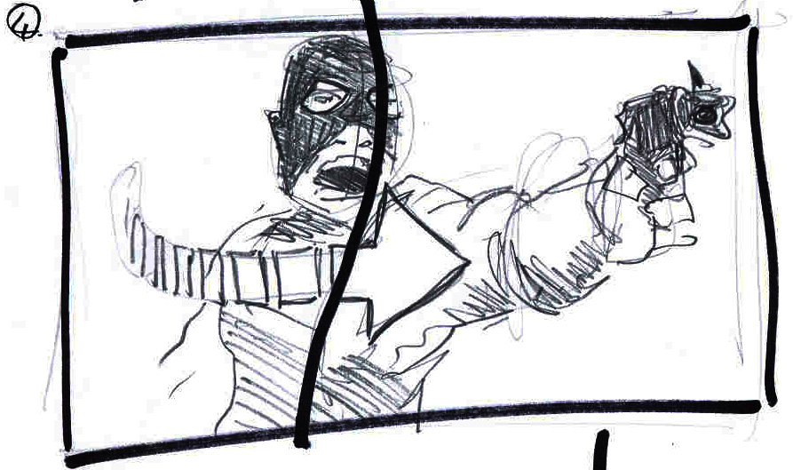
A tighter shot of the antagonist. 


As seen here, the original sketch's LoA arcs are left intact.

Final rendition.

Frame 1. Tilted angle, top shot. Gun-man shoots into the sky. (Identified as The First Pillar)
Frame 2. Wide. Street civilians become startled and alert to the gunman's presence. (Secondary beat)


Frame 3.  Reverse angle. A lone civilian remains rooted, opposed. (Secondary Beat)


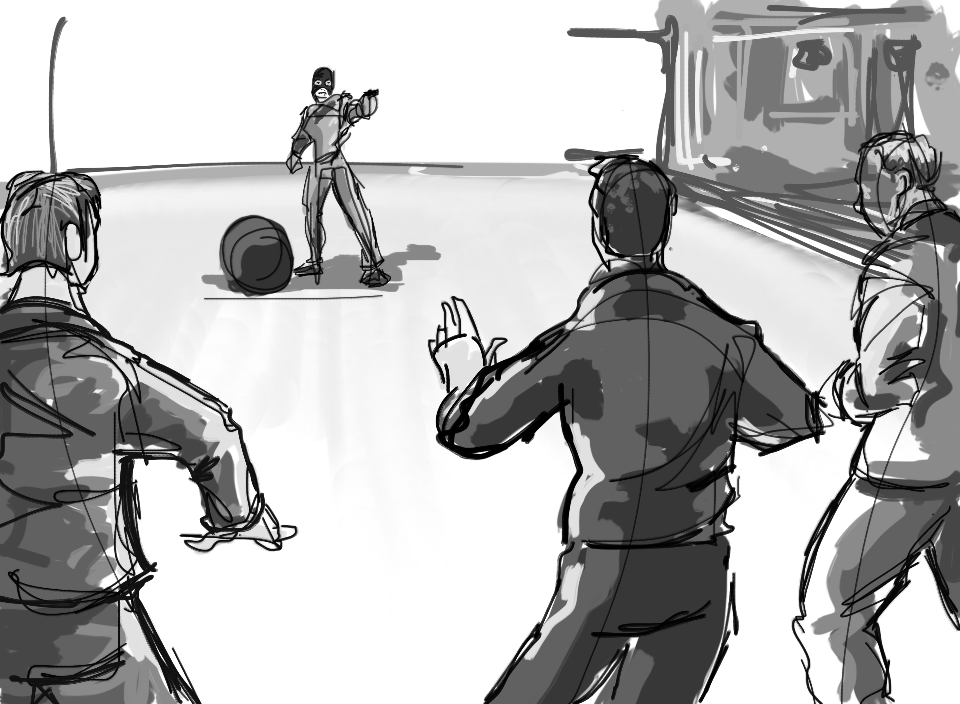
Frame 4. Over-the-shoulder. Gun-man threatens civilian. (Secondary Beat)


Frame 5. Tighter shot of gun-man, pointing gun off-frame. (Secondary Beat)


Frame 6. Medium wide. Civilian tackles gun-man swiftly. (Identified as the Second Pillar.)


Frame 7. They tumble to the ground, bomb center frame. (Secondary Beat)


Frame 8. CU. Bomb counter depletes. (Secondary Beat)


Frame 9. Dolly zoom, CU. Civilian cries out- (Secondary beat)


Frame 10. Wide. Bomb explodes, hurling civilian back by force. (Identified as the Third Pillar.)


Though not a wholesome narrative in itself- in that this sequence would naturally segue into a broader narrative; but as a segmented sequence with its own inner-narrative we can see Compression, Line of Action, and a subtle application of colour Inference. Even for Black and White storyboard artists, the easily applied colour to signify certain themes becomes just as economical when digitizing. The editing process is tremendously cut short, enabling easier corrective steps and iterative reproductions.

Final evaluative outcome:

  • Compression application; Three Pillars, Secondary frames.
  • Line of Action informs composition
  • Colour signifiers can be appropriate to Black and White Storyboarding

Micro Project: 3D Storyboarding?


This micro project is a follow on from my previous blog-post about the usage of 3D in production illustration for The Hobbit. As promised, here I attempted to apply 3D anaglyph rendering to the process of Storyboarding. 

As said before, not being a fan of 3D in its form in Cinema, I was even more clueless at how you even create the most basic image through this 'technology'. Below are my crude- and decidedly failed- attempts at creating a basic 3D image.

In Photoshop, a quick layered image of a Tree. The tree and the grassy plain beneath are the foreground; the mountains/hills are the middle-ground; and the sky becomes the background. This became the template image.


In researching anaglyphic imagery, the most common colours used are Cyan and Red. Below was a rendering of the same image in a near cyan colour.


And the other in red.


The last stage was to layer the colour versions over the original black and white image, separating- as I had assumed- both the cyan and red layers appropriately to create the 3D effect. If you have any 3D glasses on...you will see how I failed miserably. But this was an important stage in realizing I had to explore a more economical and less convolated means of achieving this. And more importantly, achieving this successfully.


Second Attempt. 
After some re-thinking and tinkering with layers, I discovered that, lo and behold, Photoshop had already done most of the leg-work for me. Each image on a layer has colour channels. These colour channels are divided into Red, Green and Blue. (the latter two more or less become Cyan.) With a little channel/layer movement, I finally created my first anaglyph 3D frame.


The process became simple:

  • Create your image
  • Duplicate layer
  • Click colour channels
  • Select Red layer
  • Select entire canvas (ctrl+A)
  • Select move tool
  • Move Red layer to the left as desired


With that figured out, it became clear I needed to consider how this could be used in a Storyboarding context. Simply rendering an image in 3D does nothing to the narrative or logistics of boarding. So the question was: what could 3D solve that we can't already? 

Although 3D is a misnomer of sorts- in that we are creating the illusion of three dimensions via flat drawings anyway- I came to the conclusion that the most obvious aspect that 3D could effect is the visual description of Lens types. As any Storyboard artist knows, there is already a set means of visually describing camera movements and lens types through our own 'language' of arrows and icons.


Directors, cinematographers, and illustrators know what these arrows denote. Below are examples (from my Brief planning) of how I would communicate a Dolly Zoom, depth of Field, jump cuts, etc.


Now I needed to see if 3D could recreate this effect. Remember, the point was not that this sequence would become a 3D feature; but rather the 3D element here has become a tool to describe a camera movement, even if the final sequence remains 2D in post-production.

Whilst creating this image, I kept in mind the need to be able to separate these into layers. The hand becomes the foreground (untouched by the anaglyph rendering) whilst the rest is 'pushed' back.


A second iteration fine tuned the layering process. This time I was able to control the amount with which the separate layers were pushed back. The hand remains untouched, whilst the head's red layer is only moved a fraction. The background is pushed away significantly. I think this is somewhat a success in that it certainly re-creates the result of a dolly zoom.


Here was another test in exploring 3D's enhanced visualization of field depth. Below was a sketch showing how I proposed to breakdown one of my storyboard frames (from the Brief) into a clear division.


Again, this was the first step of turning the entire image into a 3D image.


And here the clear three-part separation can be seen.


Jump cuts are often a tool employed by Storyboard artists, or tracking shots that span a single frame with inner-frames denoting what the audience will see, and what they won't.


Repeating the same process I isolated an area with which I wished to turn 3D. In this case it became a recreation of a jump cut. 


A second alternative, and perhaps a little easier to read. With the previous attempt, the 3D became difficult to read as it pushed the jump cut away from us. This time I switched it around, pushing the background away, and leaving the area with which we are supposed to be observing intact. 


Evaluation.

After these experiments, I've struggled to justify an alternative means of visually communicating camera motions commonly found in storyboards. Whilst the dolly zoom and jump cut remain effective, the time and process is a negative that cannot be ignored. Moreover, the current system of arrow icons as employed already successfully communicate these logistics. 

Granted, I was only able to use the anaglyph approach. There are other forms with which this could've been easier; other technologies that are not available to me. That said, by simply evaluating the benefits of turning a storyboard into 3D, we can see that 3D isn't solving any problems that are already present in Storyboarding. In truth, they simply add to the execution time for the artist, where a simple arrow would communicate all of the above faster, easier, and just as cleanly.

Here's a breakdown of the pro's and cons.


Although I am somewhat pleased to see that this doesn't work- as I've said before, I'm no fan of this process in Cinema-it is interesting to see that where The Hobbit has discovered a new means of applying 3D thinking to the creative process, it may be that I've hit a brick wall where it ends. There's nothing productive to be found here at the Storyboarding stage. In the animatic stage? Certainly. In Production illustration? Maybe.